
How Good UX Design Increases Conversions by 200%+
How Good UX Design Increases Conversions by 200%+
Backed by Data, Strategy, and Real-World Results
Want more conversions? Start with your UX design.
Too many businesses focus on traffic, ads, or email funnels—while ignoring the one thing every visitor touches: your user experience. Studies show that companies investing in better UX see up to 200% or more increase in conversion rates.
At Xoier, we specialize in building UX-optimized websites and funnels that don’t just look good—they guide users, reduce friction, and drive revenue. Here’s how great UX design transforms conversions—and how you can apply it.
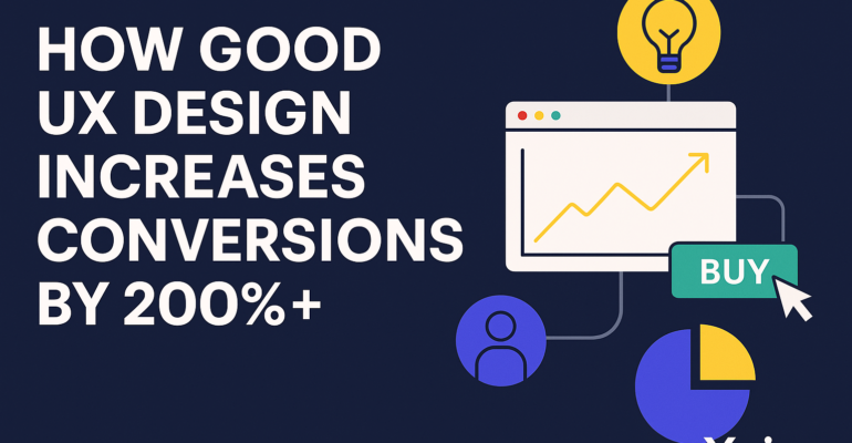
📈 What the Data Says About UX and Conversions
- 88% of users won’t return to a site after a bad experience (source: Amazon Web Services)
- Good UX can boost conversion rates by up to 400% (source: Forrester)
- Every $1 invested in UX returns up to $100 in ROI (source: Forrester)
These numbers aren’t theory. We’ve seen the results firsthand with our clients at Xoier.
🎯 How Good UX Design Boosts Conversions
1. Streamlined Navigation
If users can’t find what they’re looking for in 3 clicks or less—they leave. Intuitive menus, sticky nav bars, and logical structure improve engagement and conversion flow.
2. Clear Call-to-Actions (CTAs)
Every CTA should stand out and feel natural in the journey. Great UX ensures the CTA is in the right place, with the right message, at the right time.
3. Fast Loading & Mobile-First
Slow sites kill conversions. Google says 53% of users abandon pages that take more than 3 seconds to load. Good UX includes performance optimization and responsive design.
4. Reduced Cognitive Load
Less clutter = more clarity. White space, visual hierarchy, and clean layouts help users focus and take action faster.
5. Trust Elements & Social Proof
Trust signals like testimonials, reviews, certifications, and security badges improve user confidence. Good UX integrates these naturally into your design—not just as afterthoughts.
📊 Real Case Study: B2B Service Funnel
Client: SaaS company in the logistics space
Problem: High ad spend, low form submissions
Solution: Redesigned landing page with better flow, faster load time, clearer CTA, trust badges, and optimized form UX
Result: Conversion rate improved from 2.1% to 7.8% in 4 weeks → 271% increase
💡 Small UX Tweaks That Make a Big Impact
- Change “Submit” to a more specific action CTA (e.g., “Get My Free Quote”)
- Add icons next to key benefits
- Use a multi-step form instead of one long block
- Ensure your mobile CTA button is thumb-friendly and fixed
At Xoier: We run split tests, scroll tracking, and real-time behavior analysis to refine every part of the user journey.
🧠 UX Design Isn’t Just About Looks—It’s About Performance
Investing in user experience doesn’t just make your site look better—it makes it work better. That means more leads, more sales, and more loyalty.
Whether you sell products, services, or subscriptions—your UX is either helping or hurting your conversions.
🚀 Want UX That Converts? Let’s Build It Together
Xoier combines design psychology, technical performance, and marketing strategy to deliver websites and landing pages that drive results—not just traffic.